A bold reimagining of a much-loved cultural cornerstone can refresh a tired facade and add a new lease of life to an everyday staple.
But should a rebrand be a discrete process of evolution, like Pepsi’s recent brand refresh that largely went unnoticed, or should a rebrand be a bigger moment… and if so, should it court controversy like Jaguar has?

Now that Jaguar has unveiled its new concept car, David Sykes and Jamie Hogue from Carrington’s PR team, share their thoughts on whether Jaguar’s rebrand is toothless or a triumph.
Annnd… they’re off!
“Jaguar’s rebrand is modern, glitzy and more inclusive’
David Sykes argues:
“When I think of the typical Jag driver I think of Bill Nighy in Shaun of the Dead – the deary, condescending middle-class “mother f****r” who apparently loves his Jag more than anything else in the world (but turns out to have a heart of gold).
Winding back the clock, Jaguar used to be cool – James Bond battled an invisible XK-R with rocket launchers, while the XJ220 and the iconic E-type are still astonishing-looking vehicles. More recently, however, Jags seem to have become such a mainstay of comfortable baby boomers that the brand looked close to retirement itself.
That’s certainly not the case now.
Brands must adapt – and there’s power in owning your audience
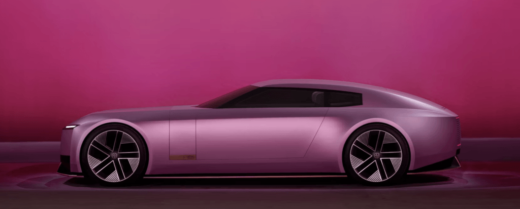
The world has moved on from ‘grace, space, pace’ and today’s high-end consumers are drawn to technology, quality, self-expression and values like sustainability. These are certainly demonstrated by the new Type 00.
The new Jaguar matches the tastes of its intended audience; it is more glitzy, modern, gadgety, sustainable and iconic. This car won’t appeal to everyone, but it doesn’t have to, and maybe that makes it even more attractive to the people Jaguar needs to impress.
Now that we have the benefit of viewing this whole campaign, I’d say that (barring a few leaks) it’s been a well-executed masterplan: Most brands would be lucky to get a new concept car on the cover of a few car magazines while the rest of the world passes it by. This time, Jaguar has created a media moment that’s been covered extensively by mass media the world over – They got people to pay attention and tune in at their key moment
By staggering the announcements like this, they maximised their audience and got people to count down the days to their Miami unveiling so they could make up their minds for themselves. The controversy over their new logo gave them an even greater boost because all of the engagement online and on social media meant the concept car was bound to appear on everyone’s news feeds and ‘for you’ pages when it was unveiled.
Yes, many people – particularly your typical Jag buyer – might be upset, critical or even offended by the “woke” rebrand, but by going for a bold, unapologetic approach, Jaguar reached a far larger audience, getting millions more potential consumers to think of the brand in a new, more positive light.”

“Jaguar’s modern rebrand is an erosion of identity that literally strips its iconography away.”
Jamie Hogue responds:
“Listen, I understand logically that brands must adapt to stay relevant. After all, almost three-quarters of S&P 100 companies have rebranded in the first seven years of being in business, according to research by Landour.
Becoming interesting is one thing, but maintaining equity and relevance is a much more difficult feat. But for an established luxury brand to dispense with the very outre visuals that cemented it as one of the world’s foremost automotive manufacturers is, in my view, taking a step backwards. It’s a leap in entirely the wrong direction.
Go on, give us nothing
This isn’t simply about one brand diluting its visuals to distil and simplify its messaging. Balenciaga, Yves Saint Laurent, Burberry and Balmian – they’re all part of a pattern of high-end brands making their logos more homogenous by opting for the widely spaced, minimalist font. Of course, there are some benefits to this – it can make the text more legible on digital platforms and handheld devices, for example – but I feel it devalues high-net-worth brands by making them all look virtually identical.
Perhaps this comes from a dislike of minimalism, as I’m a fan of ‘more is more’, but minimalism doesn’t mean ‘yes, give us absolutely nothing’.
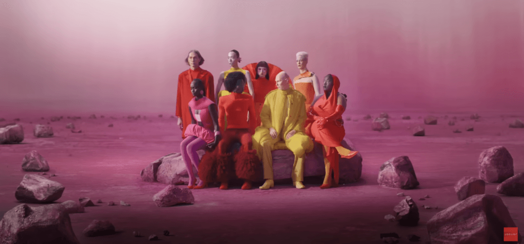
That’s not even touching on the bizarre advert accompanying the rebrand, which feels like a fever-induced mash-up of The Hunger Games and Lady Gaga’s Stupid Love video. David’s correct in the sense that it’s generating interest – as we’re all actively talking about it – but not all press is good press.
I will say that the campaign rollout is nothing if not cohesive, and I enjoy the consistency. The new Jaguar 00 does indeed feel like it is the natural complement to the modern, stripped-down rebrand – but I personally find the lack of classic features and the simplified visuals deeply unappealing.
Where do you stand on this debate? Is Jaguar’s latest reinvention a timeless classic, simplified – or a leap too far?
If the reaction to the car itself is anything to go by, the rebrand perfectly heralded the arrival of the brand’s latest offering – which dispenses with its classic, timeless features in favour of sleeker, more modern look. However, the reaction has been as mixed and “polarising” as the rebrand itself – and, in my opinion, looks like something we might see generated in an early PS1 game.
Well, at least it’s only a concept so far… let’s see how the design evolves as Jaguar responds to the global response…
Carrington: your PR & digital marketing partner.